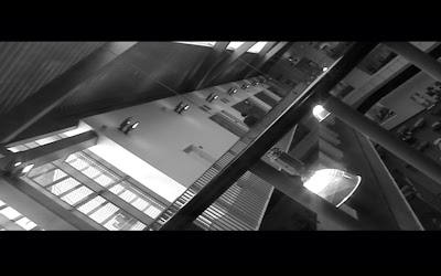
For our second assignment, we had to film an 8 shot odyssey of a journey experimenting with a conglomeration of techniques and contrastive camera angles such as a Dutch tilt, low angle and high angle shots. I hightailed around the forbidden depths of the college looking for felicitous locations to forge together while trying to make them enthralling as possible, as these 8 shot journeys were not habituated to have speech or a cappella of music, just the imagination of film making to tell a narrative, in distinction I tried to scrutinize locations that apprehended a lot of ambience such as the atrium. When it materialized to the editing suite, I wanted to desaturate the movie, catching away the colour within the shots to make it more endorsing towards the audience in a surreal manner, I did suffer with a number of technical issues such as scything the movie together and cumbering the tape onto the almighty Mac and commuting it to anamorphic. I allocated a few slide transitions to make my movie run fluently as some of the shots I filmed were out of place due to slipups with the time zone signatures amongst the video camera. The software we were using was Final cut pro that is at professional standard, the software they use to compile within the movie industries. The Final Cut (Pro) interface has four main windows: the Browser, where source media files are listed; the Viewer, where individual media files can be previewed and trimmed; the Timeline, where media can be cut together into a sequence; and the Canvas, where the edited production in the timeline can be viewed. After a few minors of absurdity, I got use to the programme and it became easier to apply effects, render and to stream into the timeline. The best part I enjoyed about the project was being able to have the freedom to illustrate a movie that interrelates with you and shows how a silent movie can have so much meaning towards the audience just on the way the video camera is placed, not just reading upon the moves of a subject or a character but encrypting from a shot within a sequence.
1st Shot (Dutch Tilt) 3rd Floor Atrium
I'm going to shoot in black and white to persevere a surreal tone to it. The shot will take place on the 3rd floor and the camera will be set on a Dutch Tilt to make it seem abstract and peculiar. The shot will show a person walking towards an exit to pursue to the next shot. The shot will show a foreground, middle ground and a background to captivate every aspect of the audience attention.
+15102009+224800.jpg)
2nd Shot (Low Angle) Stairs
A Low Angle increases height and gives a sense of speeded motion. The reason why I’m using a low angle shot because it conceives a sense of confusion towards the viewer of powerlessness within the action of the scene. The background of the subject will lack in details adding to the disorientation of the viewer. The object or character will get swallowed up by their setting- they soon become part of a wider picture. The shot will only show the top half of the person walking down a flight of stairs and then enrols on to a close-up cut-in clip of the hand dragging from the stair banister only concentrating on a specific intimate detail. The added height of the character may inspire fear or insecurity towards the viewer, who is psychologically dominated by the figure appearing upon screen.
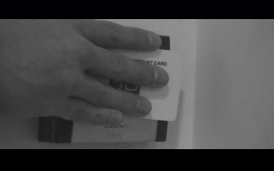
3rd Shot (Extreme Close-Up) Door Swipe System
The shot will magnify beyond the human eye would experience in reality. The shot will focus on exiting from the stairs by swiping a card to open the door; the camera will concentrate on the swipe system and the person swiping the card to be able to exit. This shot will be blurred only pin-pointing details upon the card to capture the importance of this particular item. This show will be a very-artificial shot and will build up a dramatic effect. The tight focus required means that extra care must be taken when setting up the tripod and the lighting and keeping the camera still as any sign of camera movements will seem very noticeable.

4th Shot (Long shot) Corridor
The shot will capture everything in life size corresponding to a full shot showing the entire human body, with the head near the top of the frame and the feet near the bottom. This shot will focus upon the character and will still have plenty of background to be able to establish where the camera is filming; this shot will only film from the back of the person leading toward the atrium exit. A long shot will denote a precise location and the character will seem to get smaller in a blurred constriction.5th Shot (Mid Shot) Atrium Entrance
This shot will show the knees/waist up and will capture some sense of action. The shot will focus in upon the characters surrounding through the eye of the character almost a variation of an over-the-shoulder shot, which positions the camera behind a figure, revealing a background, object or figure. The camera will be placed behind the character just dipping from the Atrium so the audience can slip through as the observer experiencing a new surrounding as some hallucinating experience.
6th Shot (Bird’s-Eye view/High Angle) Atrium
I’m using this shot as I’m shooting a scene from overhead, a very unnatural and strange angle. This shot personifies the audience in a godlike position, looking down upon the action. People can be made to look insignificant, ant-like, part of a wider scheme of things, almost in the style of Hitchcock; this shot will be elevated upon the 3rd floor to give a general overview of the Atrium. High angles make the object photographed seem smaller, inferior or scary. The shot will focus upon the character walking towards the exit swiping out towards the main entrance/exit.7th Shot (long shot) Atrium Entrance/Outside
This shot will be limited and short just specifying a new location. The camera will be placed as a long shot capturing the whole embodiment within the lens capturing the character exiting the building. The lighting will also have an effect upon telling the story as it will seem brighter compared to closed locations.
The shot will signify the end by escaping from the building. The camera will be placed at the outside of the entrance and is a scene-setting shot. There will be very little detail visible from the shot it’s meant to give a general impression rather than specific information. The character in this shot is running away from the establishment escaping from reality into a trance of surreal taunts.
DANIEL'S 8-SHOT JOURNEY
Building Blocks of Cinematography
A frame is a single cell of film. In film-making 24 frames make up one second. So real time film is 24 frames per second (fps). In video, if you wish to shoot real time you will need to shoot 25 fps. In film and video, a shot is a continuous strip of motion picture film, created by a series of frames that run for an uninterrupted period of time. A sequence is a series of scenes which form a distinct narrative unit, usually connected either by a location, unit, or a passage of time. They can also follow a narrative and usually have a beginning, middle and an end of some description. A movie (film) or programme, are entire bodies of work. They are created through frames, shots, scenes and sequences. They also have some form of a beginning, middle and end.
Shot Sizes: Communicating Meaning
There are a variety of shot sizes, from extreme close ups (ECU) to a very long shot (VLS)/ wide shot. Different shots serve a different purpose and they communicate information, emotion and details of the intended meaning of the Director. Generally when filming you start away from the action (LS) and gradually move closer (CU) drawing the viewer into the scene and the action. To establish a location or setting it is best to use a wide shot so the viewer can drink in all of the general information. And as there is a lot of it, it needs to be onscreen for a while. If the Director wants to communicate or highlight something of interest to the viewer, such as an important prop or character emotion, they are likely to use a close up. These need less time onscreen as there is less information to take in.
Composition: Rule of 1/3rds
The rule of thirds is a fundamental rule of composition that objects placed off centre are more interesting to look at. A grid is imagined over the fame (like noughts & crosses) and generally the eyes are on the top line (eye line), the horizon on the bottom (horizon line) and the subject on either of the two vertical lines. The sweet spots are where the lines intersect and where you want to place the subject, considering looking/moving space.
180º Line Rule: Line of Action
The line of action is and imaginary line you must not cross, or the action will be inconsistent when you cut together during the editing process. Position 1: Camera below the line, action is moving from right to left in the shot. Position 2: Camera above the line, action is moving from left to right in the shot. You must always film the action from one side of the 180º line or your action will not edit properly and the movement in the shot will simply not work. The only exception is if you cross the line during a shot by moving the camera across the line during a tracking type shot.
Camera Angle
- High angle shots make the subject of the shot seem weak and inferior.
- Low angle shots make the subject seem strong and powerful.
- Canted angle or Dutch tilt shots make the frame seem awkward and mysterious as we do not see the world this way.
Camera Height
As human beings we generally see the world at eye level standing up or sitting down. If we shoot the camera at eye level it is how we are used to seeing the world, so it is comfortable.
Use of Line and Diagonals
Using lines within your composition can add drama and make your shots more dynamic and lead the viewer’s eye within the shot.
- Diagonal lines add interest and energy to your shots.
- Curved lines can be graceful and very easy on the eye.
- Camera Depth of Field and Action Planes
Shallow focus is when certain subjects are in focus and other elements are not and you have a small depth of field. It draws attention to what is in focus. Deep focus is when everything in the shot is in focus and you have a large depth of field. It makes everything in frame seem important as it is all in focus and sharp. Action planes are the foreground, middle ground, and background. The best and most interesting shots incorporate all of these or at least two.
Film/ TV Conventions
Continuity of travel: If your subject enters the shot camera left and exits camera right, this must continue. Only if your subject changes direction in shot and enters camera left and leaves camera left. This works both ways.
Edit points: When shooting, consider your edit points in your head. A good way to go is to let your subject completely leave the frame and then completely enter again in the next shot.
Cut ins and cutaways: These are shots that can help with continuity and also adds to the action. For instance, cutting away from a LS of someone lighting a cigarette to a CU back to the LS. They add interest and can cover up mistakes. Compression of Time Film editing is all compression and manipulation of time generally to compress (montage) but can also elongate (slo-mo)


+15102009+224800.jpg)


